|
|
Post by Vidanric Drexley on Jun 24, 2007 15:51:47 GMT
New thread for Term Two!
Um... I don't have anything to start it off. How about the avvies in my signature? Black and white, pretty plain. A bit too plain.
Oh, I've completed two more requests in my graphics board.
|
|
|
|
Post by Vidanric Drexley on Jun 26, 2007 3:30:26 GMT
ARGH, I missed the contests deadline! Whatever, I'll show it to you guys. This for an icon contest where we had to only make icons using tutorials written by a person named Vicky. I missed the deadline =(  Feedback, please? And sorry for the double post. |
|
|
|
Post by Hannah Jackson on Jun 26, 2007 14:34:06 GMT
Pretty  I like how clear and sharp they look |
|
|
|
Post by Vidanric Drexley on Jun 26, 2007 18:08:20 GMT
I did a sig with the same coloring technique (Chad Michael Murray premade signature):  |
|
|
|
Post by Hannah Jackson on Jun 26, 2007 18:49:34 GMT
Oooo I like. It's fitted together really well and proffensionally. The only thing I have against it (there's always something...) is that it's a little bland. It doesn't stand out much, and there's no real focus. Still, I'd be proud to have made that |
|
|
|
Post by TBA on Jun 26, 2007 19:26:34 GMT
Ooh, Scarlett, me likeys! I made one quickly, I actually used a texture  For once!  |
|
|
|
Post by Hannah Jackson on Jun 26, 2007 19:32:06 GMT
Wow.... Could you get any gayer? Lol I'm joking. It looks really funky The colours are fantastic. It needs a focus though... it's a little busy without something specific which is meant to be looked at. |
|
|
|
Post by angelaslipknotfan on Jun 26, 2007 19:34:28 GMT
lol Scarlett! I like the font you have used in the Chad Michael Murray one! It looks really nice, but...he looks so...GAY!!!!!!!! Eww, eww, eww...I don't like blondies at all! As for the Kirsten Dunst one, it's just perfect! I haven't seen something like that before and it rocks!!! Zaid's graphic looks soooo pretty!!! It is really cool! I love the fact that it has all these bright colours!! Good job!!! *thumbs up* |
|
|
|
Post by TBA on Jun 26, 2007 19:35:07 GMT
LOL. It was all black and white to start with. So I colored it in. (Not to mention I actually did the pics and stuff , duh. They were brushes, mostly, and a texture). |
|
|
|
Post by Vidanric Drexley on Jun 26, 2007 20:09:53 GMT
Ooo, pretty colors, Zaid! I want to try using only brushes and textures, but I'm on my laptop which has no brushes but for tiny text brushes. Woah, that might make an interesting icon.
And I love blondes! Hrm, I just noticed the image on the right side of that sig is brighter than the one on the left.
|
|
|
|
Post by TBA on Jun 26, 2007 20:20:57 GMT
Where do you get tiny text brushes from? I could only find one on DeviantArt!
|
|
|
|
Post by Vidanric Drexley on Jun 26, 2007 20:25:46 GMT
I don't know what happened to them. I had originally found a bunch on deviantArt a few months ago. They're all gone now, replaced by a lone pack of them. Let me see if I recorded the username of the one who made them.
|
|
|
|
Post by TBA on Jun 26, 2007 20:27:19 GMT
Aww. It was horrible, they only had one pack! And that wasn't too good either!
|
|
|
|
Post by Hannah Jackson on Jun 26, 2007 20:31:18 GMT
I have absolutly no idea what you're talking about....
|
|
|
|
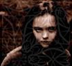
Post by TBA on Jun 26, 2007 21:45:39 GMT
OK, the blending is SO bad:  |
|


 I like how clear and sharp they look


 For once!